Branding Guidelines
Please adhere to the following guidelines when using our logo, colours and icon in your materials. For any questions regarding our brand usage, please contact us at [email protected].
Our Logo
The logo is an integral part of the Pelvic Awareness Project and should be used thoughtfully and consistently.
Most often the logo will be presented in Beige (pantone 4275C) as displayed on the right.
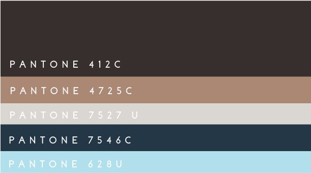
Important Note: Refrain from using any colors outside of our color palette as displayed below.
Primary Logo
Variation
Color Palette Variations
The Icon Design
The icon holds the shape of the pelvis with the double P’s representing the Pelvis. The icon encompasses the identity of the brand.
Color Palette
The colors are considered the primary colors of the brand and speak to the human elements of the Pelvic Awareness Project.
Brand Pattern
The brand pattern is a key indicator of our brand design and should be used for backgrounds and design elements in collateral pieces.